About Kevin Kim
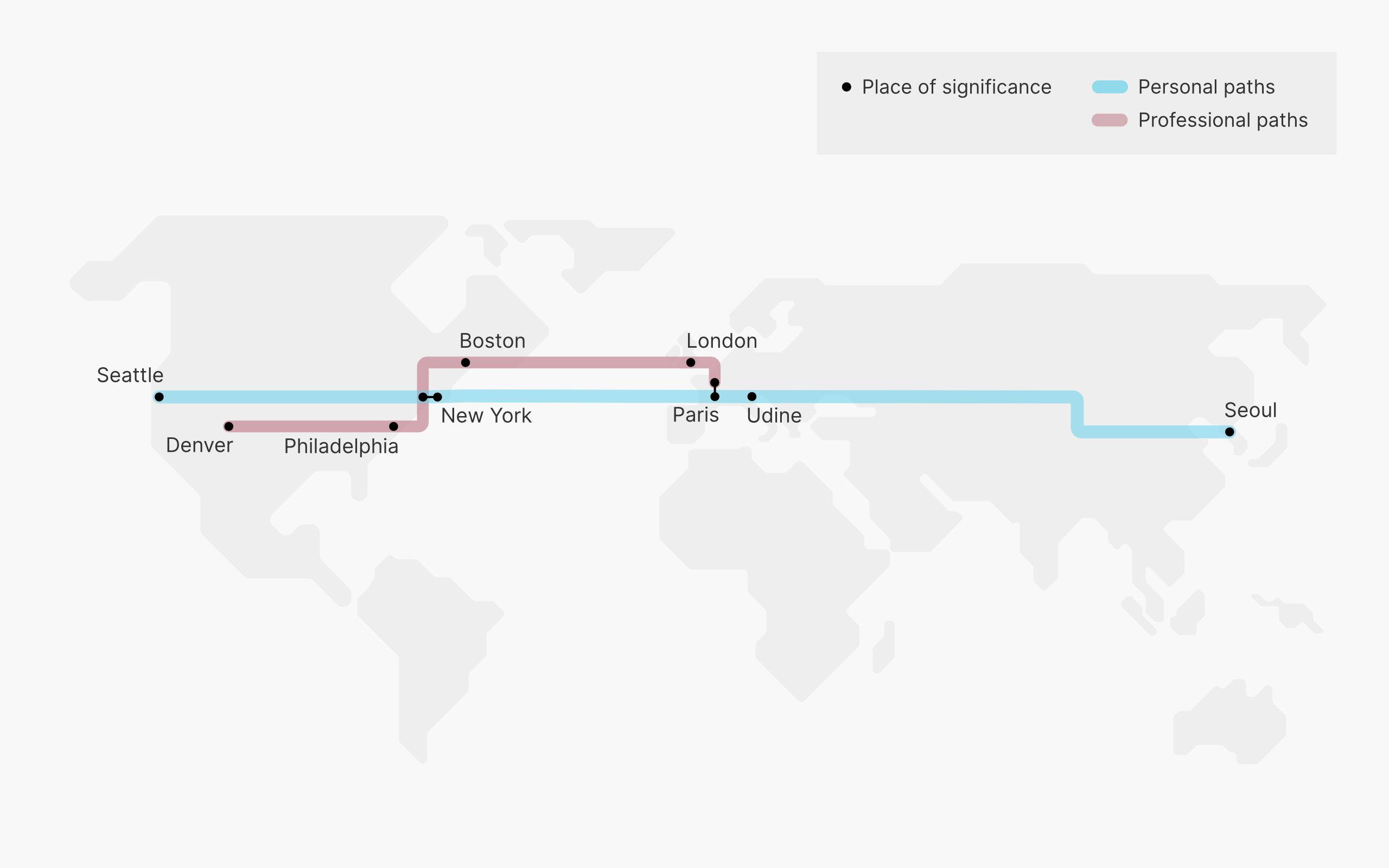
When I was six years old, I rode the Seoul subway for the first time. I remember staring at the map with fascination — the colorful subway paths drew me in, but it was the message behind those lines that kept me engaged. I learned where my grandmother’s stop was located on the purple line, and from that moment on, the city opened up to me like a book that was begging to be read. The map was a minimalist abstraction of the city in which the only written characters were the names of the stops and the map legend. Yet somehow, this colorful weave of lines against the plain white background spoke volumes to me. Every time we went somewhere by subway, I insisted on locating our destination on the map and guiding us there. The more transfers, the better; I was always eager to trace out our paths, identify our transfer points, and go from one color to the next. This is my earliest memory of appreciating good design. Even today, I have a particular fondness for subway maps and their ability to take the concrete chaos of a large city and create visual simplicity and order for the users. When I was six years old, I may not have understood the deliberate design techniques used to make the Seoul subway map so effective, but I did feel a great deal of satisfaction in making sense of the intricately placed lines and circles. In my professional life today, I constantly think about how a product, experience, or visualization can be crafted to bring that same sense of satisfaction and ease of use to the user. I was born and raised in Seattle but have called New York home since 2010. Having family in Korea and Italy, and also having traveled a lot during my work as a consultant, I have spent a lot of time on the go appreciating the differences in the way people live, think, and interact with their environments. I often find myself thinking about the way things are, observing little details in the way things are designed, with the aim of bringing joy to others through my own empathy and intellect.

